Coldplay? Owl City? Lights? Por Que no Las Tres?

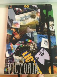
A couple weeks before Christmas, I was approached by my friend Nathan to make a journal for another friend. All I was given for an idea was the names of her three favorite bands: Coldplay, Owl City, and Lights. This was, honest to goodness, one the funnest experiences I’ve had creating in a very long time.

IMG_5494   IMG_5496

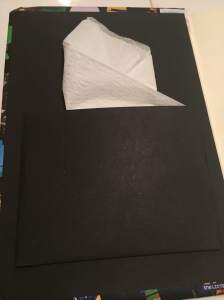
As you can see, I made the cover a collage. It was interesting, and a new kind of fun, to paste each album cover into place. It was a challenge I look forward having more of in the future. For the pocket on the inside of the front cover, I used a single fold technique. This allows the owner to completely close the journal.

Nathan was ecstatic that I included all three of his friend’s favorite musicians, and Victoria loved it!
M is for Melody

This slideshow requires JavaScript.

I made this canvas set for my friend Melody last spring.

As you can see in the pictures, the colors in the background match her comforter. I took one of her pillow cases to Hobby Lobby and picked colors then mixed them to match her bedding.

It was fun for me to tape the white-painted canvas then peel it off later and watch the perfect lines emerge. I love the way the lines came out so crisp and clean.


Nathan’s Journal

I was spproached a few weeks ago by friend about a potential journal. As we hashed out the details of the theme and what she wanted it to look like, I found myself getting excited. Take a look:

IMG_5670 IMG_5678 IMG_5677IMG_5671

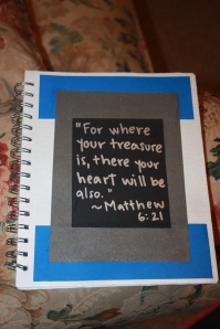
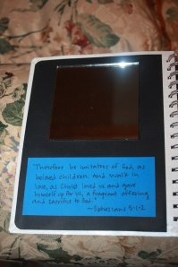
The theme of the journal’s front cover is meant to encourage the recipient (Nathan) to walk through his life in the image of Christ. The mirror was my friend (the one who ordered the journal for her friend) Blair’s idea. Underneath the mirror is Ephesians 5:1-2, which says, “Therefore be imitators of God, as beloved children. And walk in love, as Christ loved us and gave himself up for us, a fragrant offering and sacrifice to God.” When Nathan reads the verse and looks in the mirror, he can reflect on how he is like Christ and how he can be more so.

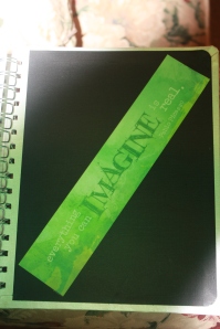
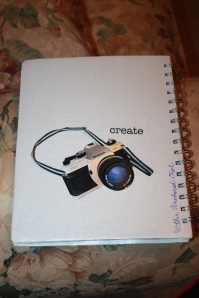
I took some liberty with the back cover. Since I know Nathan personally and know he aspires to be a videographer (you can watch some short films here on his YouTube channel), I chose that as a type of theme for the other side. The quote in green on the inside of the back cover is from Pablo Picasso: “Everything you can imagine is real.” I thought that quote would inspire him to dream big in his career, both in college and afterwards.

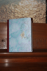
Faith is the Key

IMG_5668 IMG_5669

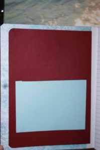
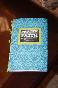
I created this journal for a new friends who is beginning a journey of faith. This one is simple, yet beautiful.

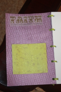
It is a ribboned journal, and only the front cover is decorated. Each of the different colors (the blue, purple, and green) all go together nicely, and the theme of faith ties them together well.

It’s also the first journal I trusted the US Postal Service with; I can’t wait until it’s delivered. 🙂

Her Very Own TARDIS

This slideshow requires JavaScript.

This journal was a surprise for my friend, and, boy, did she love it!

The thing I spent the most time working is the TARDIS picture on the front. It took a lot of hard, tedious work to carve out the letters and place the window panes in the correct places. It took about an hour and a half to to do just that.

The part I was most worried about was the back of the journal, with the clothing symbols for the 9th, 10th, and 11th doctors. It was hard to get each right, but I think they came out pretty well.

Something Yellow

Thanks to generous fellow writer Laura Templeton, I was able to place a journal in a raffle for her new book Something Yellow. The raffle will take place on October 5th, during a literacy book signing that day.

IMG_5665 IMG_5666

The journal I created goes with the overall theme of the basket, yellow and blue. She asked for a generic theme, she just did not want it to look exactly like the cover of her book. I chose yellow and blue, not only because they are the theme of the basket, but because I love the way they look together.

yellow**If you’re interested in entering the raffle, you can go to her website and enter. I will definitely be jealous of whoever wins; there is some pretty great stuff included in the raffle, and I’m not just bragging about my own handiwork. It’s all really adorable stuff:

PUSHing for Greatness

IMG_5664 IMG_5662

I recently made a journal for a close friend who is currently going through a program called “Push” that will encourage her and help her to push to greater things in life.

I was really seeking to create a really simple look for the journal, since what is inside is definitely more important in this case. I went with a cloudscape on the outside covers and gave the pockets an ocean-esque look.

For the outside, I traced the letters down the front, then hand-painted them in black.

Also, I tried a different way of making the pockets on the inside, which, as you can see, allow for a lot more space in the pocket. She even fit in a pen!

Mae: Perfect Pink

 IMG_5660 IMG_5661

If I’m to be completely honest, I was kind of scared to work on this journal. I wasn’t given much information about what was wanted, other than, “Check out my blog!” (Which can be found here.)

But do you know what she said when I gave it to her?

“…You are so wonderful. It should be illegal to be that great.”

SHE LOVED IT!!!

I’ve seen a bit of her style, and I knew for sure that she really loves the Bible, so I got her favorite verse from her friend, and I wrote her a little note and added more verses around the edges of that.

Also on this journal, instead of just having the ribbons tying the journal together, I added a braid to the top ribbon and added a charm on the end of it. It adds a bit of flavor to the journal, and if she’d like, she can use it as a bookmark!

Melodee’s 50s Diner

melodeecomp 002 melodeecomp 004

I made my first composition notebook today!

In all honesty, I was kind of nervous. I was asked to do a Retro 50s Diner theme, and I wasn’t sure what all it entailed.

But it came out great!

I had gone back and forth for about an hour in the store, trying to decide what to do, but after a few moments searching images on Google, I had a lot better of an idea of what to do.

Overall, I’m glad I was able to add a pocket on each inside cover. I’m sure she’ll love it!